Origin of our Company Name and Renewed Corporate Logo
2021.11.15
column
In February 2020, our company celebrated its 40th anniversary. In commemoration of this milestone, we redesigned our corporate logo to give it a “new normal” concept that emerged around the year 2000. This concept has changed and evolved in response to the large changes sweeping the world, much like our own company and products. In response, we blended our more historic background and modern achievements to create this renewed corporate logo.
Origin of Our Company’s Name
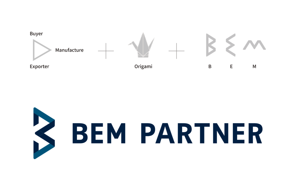
The ‘BEM’ in our company’s name, BEM Partner is an acronym made from using the first letter of the following words:
Buyer
Exporter
Manufacture
This name represents how our company as an exporter brings Buyers and Manufacturers together to create mutually trusting relationships (Partnerships). In turn, creating the synergy that drives successful business ventures together.
Design Concept
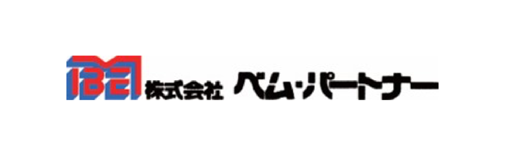
Our previous corporate logo focused on the idea that Manufacturers created the products that Exporters and Buyers bought. The resulting logo had the M housing the B and E, which implied that Manufacturers played the most important role.
Our new corporate logo focuses more on the importance that Manufacturers, Exporters, and Buyers all have an equally important role in our business. The logo takes each first letter from each of these words and fuses them into a single image. Also, the origami-style design was incorporated to portray the Japanese values of being sincere and welcoming.
Logo Color
Our new logo uses indigo blue, a traditional color in Japanese culture. Also, the color blue is a color that we naturally associate with the sea and sky. As a country that is surrounded by the ocean, this color holds the meaning and our ambition to help connect Japan to the rest of the world.